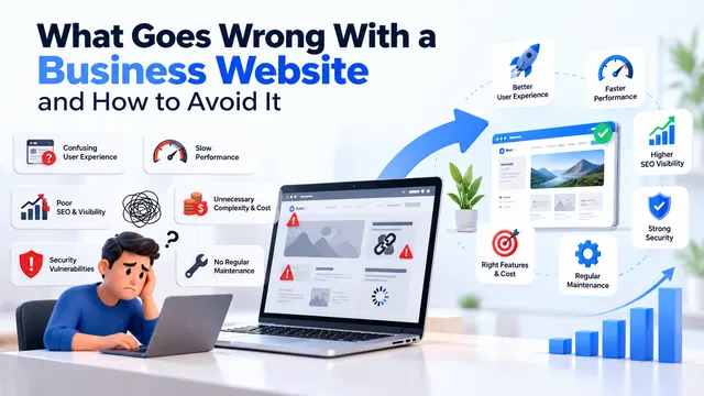
A good business website does one job well: it lets the right visitor understand what you do, believe you can do it, and contact you, in under a minute and on a phone. Everything else, from animations to chatbots, is optional. Most small business sites fail not because they look dated but because a visitor can't tell what the business offers, where it operates, or how to get in touch without hunting for it.
Below is what that looks like in practice, with examples from typical Indian small businesses. The examples are illustrative, not real client sites.
The first screen answers three questions
When someone lands on your homepage, the top of the page (what they see before scrolling) should tell them what you do, who it's for, and what to do next. A headline like "Excellence in Quality Since 1998" answers none of these. "Industrial packaging cartons for pharma and FMCG brands, made in Manesar" answers the first two straight away.
The next step should be one clear button or link. For most service businesses that's a phone number, a WhatsApp link or a short enquiry form. Two competing buttons are fine. Five are not.
Example: a dental clinic in Noida. A weak homepage opens with a stock photo of a smiling model and the word "Welcome". A good one opens with the clinic's name, the treatments it offers, the area it serves, the clinic hours and a "Book an appointment" button that opens a call or a WhatsApp chat. The real photo of the clinic and the dentist's qualifications sit just below.
It works properly on a phone
Many of your visitors will arrive on a mobile, often from a Google search or a link someone shared on WhatsApp. Google also indexes the mobile version of your site first, so a site that only looks right on a laptop is at a disadvantage in search too.
Working on a phone means more than "it shrinks to fit". Check these yourself on your own phone:
- Text is readable without zooming.
- Buttons are big enough to tap without hitting the wrong one.
- The phone number is a tap-to-call link, not an image.
- Forms are short and the keyboard shows numbers for the phone field.
- Nothing slides sideways or hides behind a pop-up you can't close.
It loads fast
Speed is something you can measure rather than argue about. Google's Core Web Vitals give three checks: how quickly the main content appears (Largest Contentful Paint, good at 2.5 seconds or less), how quickly the page responds to a tap or click (Interaction to Next Paint, good at 200 milliseconds or less), and how much the layout jumps around while loading (Cumulative Layout Shift, good at 0.1 or less). INP replaced the older First Input Delay metric in March 2024.
You can test any page for free with PageSpeed Insights. The usual culprits on small business sites are uncompressed photos straight from a camera, a heavy slider on the homepage, too many plugins on a WordPress site, and cheap shared hosting. A home page video that autoplays is rarely worth what it costs in load time.
It shows proof, not adjectives
Every business says it is trusted, experienced and customer-focused. Visitors skip those words. What they believe is evidence they can check:
- Photos of your actual work, premises and team.
- Named clients or projects, if you have permission to show them.
- Reviews, ideally linked to your Google Business Profile so people can see they're real.
- Certifications, registrations and memberships that matter in your trade, such as an ISO certificate for a manufacturer or a council registration for a doctor.
- Your full address, GSTIN where relevant, and a map.
Example: a chartered accountancy firm in Gurugram. A thin site lists "Tax, Audit, Advisory" with an icon for each. A useful one has a page per service that explains who it's for (startups needing GST registration, NRIs filing returns, companies due for statutory audit), what documents the client needs to send, and roughly how the process runs. Each page answers the questions the partners already answer on the phone every week.
One page per thing you sell
This is where a lot of sites lose search traffic. If you offer five services but describe them all in one paragraph on a single "Services" page, Google has little reason to show that page for any one of them. A separate page for each service or product line, written in the words your customers use, gives each one a chance to rank and gives each visitor a page that answers their question.
Example: a B2B manufacturer of stainless steel fittings in Faridabad. Buyers search for specific items: a particular grade of steel, a fitting type, a size range. A site with a page per product family, a downloadable spec sheet, and a clear "Request a quote" form with fields for quantity and grade will get better enquiries than a catalogue PDF attached to the homepage. It also saves your sales team from asking the same follow-up questions.
If you want help working out which pages your site should have, that's part of how we plan SEO work.
Contact is easy, and someone answers
The best website still loses the lead if the form goes to an inbox nobody checks. Before worrying about design, test your own enquiry path:
- Fill in your own contact form and see where it lands and how quickly someone replies.
- Tap the phone number on your site from a mobile and see whether it rings the right person.
- Send a WhatsApp message through the site link.
- Check that the address and hours match your Google Business Profile.
Keep forms short. Name, phone and a message box are enough for most enquiries. Every extra required field gives people a reason to give up.
What a good site usually doesn't need
Small businesses often pay for things that look impressive in a pitch and add little afterwards:
- Heavy animation and sliders. They slow the page and most visitors never see the third slide.
- A chatbot on a site with little traffic. If you get a handful of enquiries a day, a WhatsApp button answered by a person is simpler and feels more personal.
- A blog nobody will write for. An empty blog with the last post from two years ago looks worse than no blog. Start one only if someone will keep it going.
- A custom-built site when a well-made template will do. A brochure site for a local service business can be built on WordPress with a good theme. Custom development makes sense when you need features a template can't handle cleanly, such as a dealer portal or a product configurator.
Good UI/UX design is mostly about removing things, not adding them.
How to tell whether yours is working
You don't need expensive tools to check. Set up Google Search Console and Google Analytics, both free, and look at a few things each month:
- Which search terms bring people to your site, from Search Console. If none of them mention your services or city, your pages aren't describing what you sell.
- How many enquiries came through the site, by form, call or WhatsApp. Ask new customers how they found you and write it down.
- Which pages people visit before they contact you.
- Any pages Search Console reports as not indexed or with mobile problems.
If traffic is reasonable but enquiries are few, the site isn't convincing people or contact is too hard. If there's hardly any traffic, the problem is more likely search visibility, and design changes alone won't fix it.
A quick self-check
- Can a stranger tell what you do and where, from the first screen on a phone?
- Does each main service or product have its own page?
- Is there real proof: photos, reviews, registrations, an address?
- Does the homepage pass Core Web Vitals in PageSpeed Insights?
- Did your own test enquiry get a reply the same day?
If you answered no to two or more, fix those before spending on anything new. For a rough figure on a rebuild, try the pricing calculator, or send us your current site and we'll tell you what we'd change first.